
Let’s Build Playing Cards with CSS and HTML
Whether you’re learning to code for the first time or looking for a fun weekend project, recreating everyday objects is a great way to practice your skills.
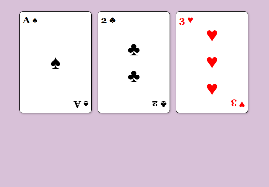
Today, let’s build a small set of playing cards using only HTML and CSS.
This project is simple enough for beginners but introduces several useful concepts you’ll use again and again, including:
- Flexbox
- Alignment
- Spacing
- Borders and shadows
- CSS transformations
By the end, you’ll have a small card display that resembles a real deck of cards.
Before We Begin
View my Playing Cards Project & Coding Files
Before challenging you to this project, I also built a version of my own:
Prepare Your Project Tools
Before building our playing cards, you’ll need a few basic tools:
- A code editor such as Visual Studio Code
- A modern web browser like Chrome, Edge, or Firefox
- An HTML file for your structure
- A CSS file for your styling
For this project, we’ll use the following file names:
- index.html
- styles.css
Step 1: Create the Card Structure
Each playing card needs three main sections:
- A top value and suit
- A center area
- A bottom value and suit
Here’s a simplified card structure.
This belongs within the “<body></body>” element of your HTML:
<main id=”playing-cards”> <div class=”card”> <div class=”left”>A ♠</div> <div class=”middle”> <span>♠</span> </div> <div class=”right”>A ♠</div> </div> <div class=”card”> <div class=”left”>2 ♣</div> <div class=”middle”> <span>♣</span> <span>♣</span> </div> <div class=”right”>2 ♣</div> </div> <div class=”card red”> <div class=”left”>3 ♥</div> <div class=”middle”> <span>♥</span> <span>♥</span> <span>♥</span> </div> <div class=”right”>3 ♥</div> </div> </main>The left corner displays the card value.
The middle section holds the large suit symbols.
The right corner mirrors the top corner.
Step 2: Build the Card Shape
Next, let’s make it look more like a real playing card with CSS:
.card { width: 220px; height: 320px; background-color: white; border: 1px solid black; border-radius: 12px; padding: 10px;}This creates a rectangular card with rounded corners.
Small details like border-radius can make a simple project feel much more polished.
Step 3: Use Flexbox for Layout
One of the most useful tools in CSS is Flexbox.
In this project, Flexbox helps position elements without relying on complicated calculations.
.card { display: flex; justify-content: space-between;}The space-between value pushes the top and bottom card markers apart while leaving room for the center symbols.
Step 4: Align the Card Sections
Each section can position itself within the card with CSS Flexbox.
.left { align-self: flex-start;}.middle { align-self: center;}.right { align-self: flex-end;}Think of these as instructions telling each element where to sit inside the card.
The result starts looking much closer to an actual playing card.
Step 5: Rotate the Bottom Corner
Real playing cards display the bottom value upside down.
CSS makes that surprisingly easy.
.right { transform: rotate(180deg);}Rotating the element 180 degrees creates the familiar mirrored appearance found on real cards.
This is a great beginner-friendly introduction to the transform property.
Step 6: Add a Little Personality
Simple visual touches can make a project feel complete.
For example:
.card { box-shadow: 2px 2px 6px rgba(0, 0, 0, 0.3);}The shadow gives the card depth and helps it stand out from the page.
You can also change suit colors:
.red { color: red;}Now hearts and diamonds can appear red while spades and clubs remain black.
Leave a Reply